Pro-tip: Press space bar to progress and it won't skip any slides
Intermediate to Advanced CSS
For Practical Peoples
Wes Ruvalcaba
Some factoids and biases- Writing CSS since 2002
- Markup, CSS & Standards Dork
- I'm a waning SCSS fan, use React and Solid JS sometimes, but usually try to stay as vanilla as I can.
- I usually avoid CSS frameworks, unless it's good for folks I'm hanidng off to.
Feel free to ask questions at any time!
People I'm Stealing a lot from
- Rachel Andrew
- Chris Coyier
- Jen Simmons
- Mozilla Developer Network
- ... and plenty of others (see sources slides)
Special thanks to:
- Frank Taylor (blog.frankmtaylor.com @paceaux)
- Aubrey Sambor (aubreysambor.com @starshaped)
We'll go over
- CSS "Units" and "Lengths"
- Media Queries
- Grid Vs Flexbox
- Advanced styling techniques & animating
- Accessibility
- Architecting CSS
- Debugging CSS Issues
- Fancy Tips and Tricks
Foreword Advice


Prologue
Debugging Tool Basics
Sample pageSome themes you'll notice:
- Only be as specific as necessary
- Best practice guidelines become more important the bigger the team or more complex the project
Part 1
Units and Lengths
Percentage
1%
33.333%
150%
.parent {
border-color: gray;
border-style: dashed;
}
.box {
width: 50%;
background: deepskyblue;
}.box
Percentage ... of what?
Text Based Units
em
1em = Calculated font-size of current element
1em
1.25em
3em
.box {
width: 2em;
background: deepskyblue;
}
.box-2 {
font-size: 2em;
width: 2em;
background: palegreen;
}.box
.box-2
.box {
  /* font-size: 16px; (default) */
  width: 2em; /* 2em = 16px * 2 = 32px */
  background: deepskyblue;
}
.box-2 {
  font-size: 2em; /* 2em = 16px * 2 = 32px */
  /* The 32px font-size will then change what
     2em on the width means */
  width: 2em; /* 2em = 32px * 2 = 64px */
  background: palegreen;
}rem
1rem = Calculated font-size of html element
1rem
1.25rem
3rem.box {
width: 2rem;
background: deepskyblue;
}
.box-2 {
font-size: 2rem;
width: 2rem;
background: palegreen;
}.box
.box-2
ex and ch
Based on the font that renders
1ex
1.25ex
15ex
1ex = Calculated width of a lower-case x
1ch
1.25ch
15ch
1ch = Calculated width of the number 0
.box {
  font-family: monospace;
  width: 25ch;
  background: deepskyblue;
}
.box-2 {
  font-family: sans-serif;
  width: 25ch;
  background: palegreen;
}Viewport Units
What's a viewport?
100vw
25vw
100vh
25vh
Physical Units
mmmillimetercmcentimeterininchptpointpcpica
Which unit should I use?
Relative Units
When size should be proportionate to the unit's basis
Sized with em
Sized with px
Pixels
A fallback, if you can't/shouldn't use a relative unit*.
* Most devs and teams I've known use pixels by default, while that has drawbacks, it's not "bad".
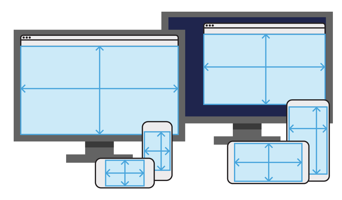
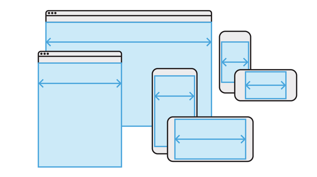
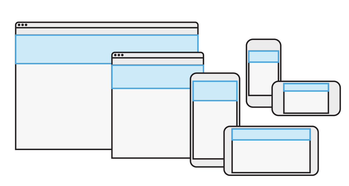
Media Queries
Media Queries
Special styles for specific circumstances
@media /* Conditions */ {
  /* CSS Rules */
}Which Medium?
@media screen { /* Computer Display CSS Rules */ }

@media print { /* Print CSS Rules */ }
Fun fact: speech, braille, embossed (braille printers), tty (like command line), tv also exist.
What Size?
@media (min-width: 768px) {
/* CSS Rules */
}
/* OR the newest Comparison syntax */
@media (width >= 768px) { /* CSS Rules */ }
@media (min-width: 48em) and (min-height: 30em) {
/* CSS Rules */
}
@media (400px <= width <= 600px) {
/* Styles for viewports between 400px and 600px. */
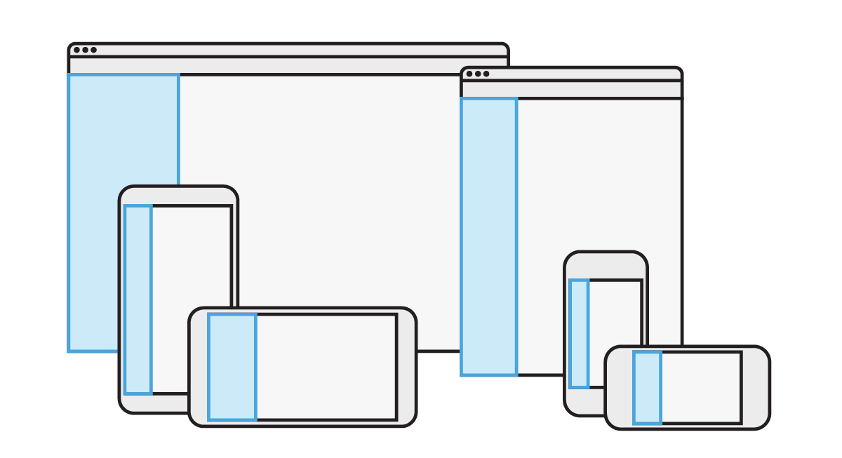
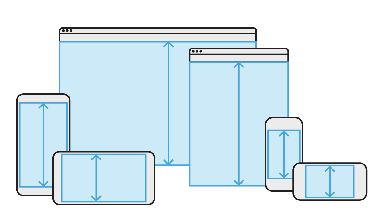
}@media Best Practices
Mobile First @media queries
Write min-width and min-height,
not max-width or max-height
.box {
  /* Mobile CSS */
}

@media (min-width: 48em) {
  .box {
    /* Decent size screen styles */
  }
}

@media (min-width: 62em) {
  .box {
    /* Huge screen styles */
  }
}
Group all styles for an element
/* Widget Styles */
.widget { }
@media (min-width: 768px) {
  .widget { }
}

/* Doo Dad Styles */
.doo-dad { }
@media (min-width: 768px) {
  .doo-dad { }
}
Only be as specific as necessary
@media (min-width: 768px) and screen {
  /* Is screen necessary, do we want to exclude print? */
  .widget { }
}

@media (min-width: 1024px) and (min-height: 768px) {
  /* Is height necessary, should 750px tall screens be excluded?  */
  .widget { }
}
Ideally breakpoints are based on content, not devices
That means asking questions like:
- Are columns squished?
- Line lengths too long or short?
- Images need to be bigger?
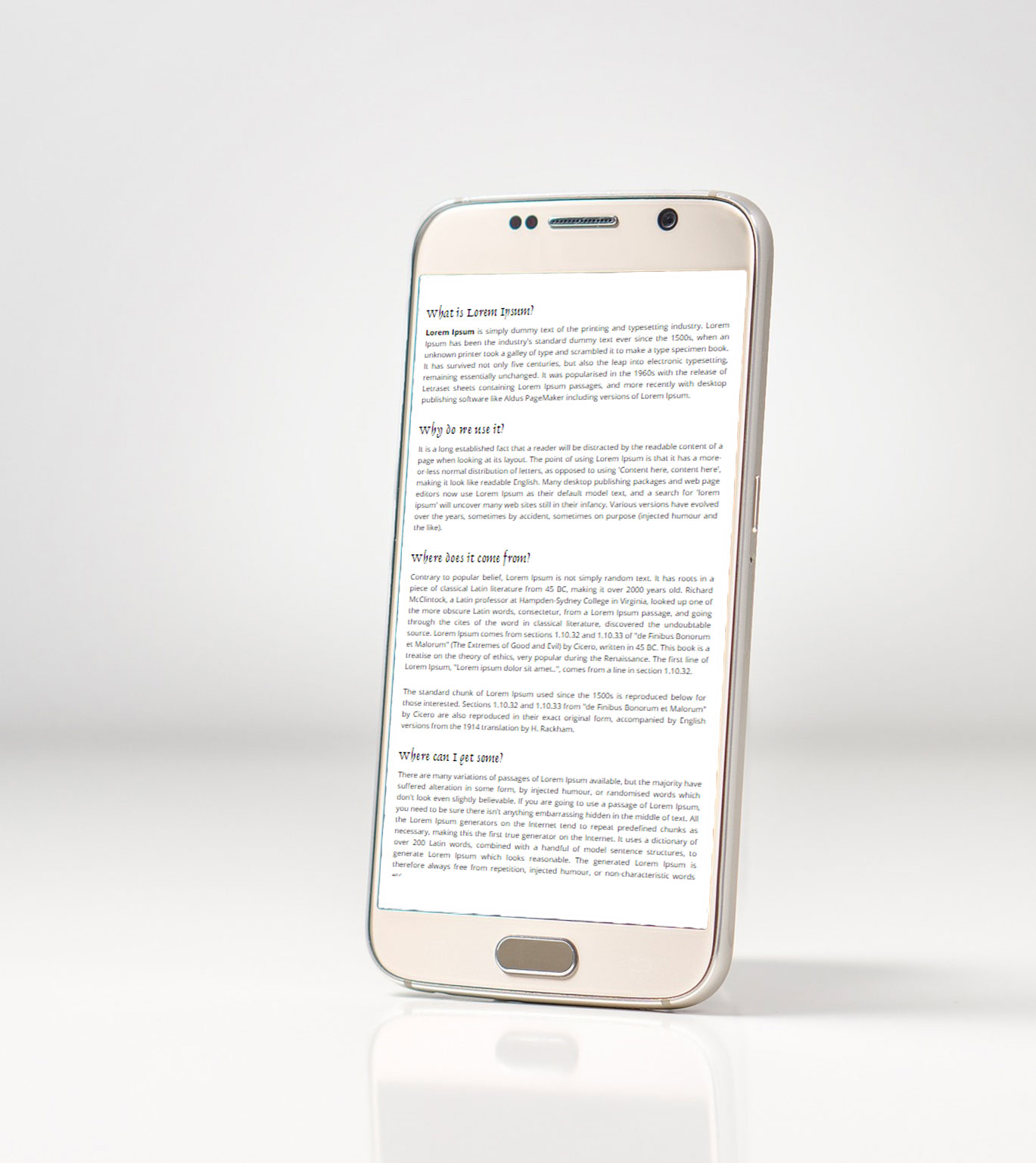
Test from 350px - 1600px wide.
This screenshot is faked
Flexbox & Grid
CSS Grid
Basics and terminology
Grid Container
Element surrounding the grid.
Grid Item
Direct child element of a grid container
Grid Line
Any line in the grid
← Grid Lines →
↓
Beginning with Grid
Basic syntax
.grid-container {
  display: grid;
  grid-template-columns: 25% 50% 25%;
}
What if there's more content than grid areas?
Let's see in this example...Grid code examples stolen/modified from GridByExample.com, from Rachel Andrew
Specifically placing a grid-item
grid-column-start: 2;
grid-column-end: 3;
grid-row-start: 1;
grid-row-end: 2;
Specifically placing a grid-item from the end!
grid-column-start: -3;
grid-column-end: -1;
grid-row-start: -2;
grid-row-end: -1;
grid-column-start: 1;
grid-column-end: -1;
Grid Item Shorthand
.my-header {
  grid-column: 1 / -1;
}

.my-content {
  grid-column: 1 / span 2;
}

.my-sidebar {
  grid-row: 2;
  grid-column: 3;
}grid-column: 1 / -1
grid-column: 1 / span 2
grid-row: 2;
grid-column: 3;
Named grid areas
grid-template-areas
Name regions in your grid.
.grid-container {
  display: grid;
  grid-template-columns: 25% 50% 25%;
  grid-template-areas:
    "header header header"
    "content content sidebar"
    "footer footer footer";
}
grid-area
Set location of grid items to a grid region.
.my-header  { grid-area: header; }
.my-content { grid-area: content;}
.my-sidebar { grid-area: sidebar;}
.my-footer { grid-area: footer; }.grid-container {
display: grid;
grid-template-columns: 50% 50%;
grid-template-areas:
'header header'
'content content'
'sidebar footer';
}Grid Units & Helpers
fr
Distributes free space in a grid track
grid-template-row: 1fr 50% 1fr;1fr 1fr /* 50% 50% (Maybe) */
1fr 2fr 1fr /* 25% 50% 25% (Maybe) */
25% 1fr 1fr /* 25% 37.5% 37.5% (Maybe) */
minmax()
display: grid;
gap: 10px;
grid-template-columns:
  minmax(200px, 1fr) 200px 200px;
repeat(number, size)
display: grid;
gap: 10px;
grid-template-columns: repeat(4, 100px);
grid-template-rows: repeat(3, auto);
auto-fit and auto-fill
grid-template-columns: repeat(auto-fit, 150px)grid-template-columns: repeat(auto-fill, 150px)Masonry like layout
display: grid;
grid-template-columns:
  repeat(auto-fit, minmax(180px, 1fr));
gap: 1rem;
CSS Grid Tips
Want equal width columns with gutter?
You may assume this would have a good result:
.wrapper {
  display: grid;
  grid-template-columns: 25% 25% 25% 25%;
  gap: 10px;
}How to get equal width columns with gutter
.wrapper {
  display: grid;
  grid-template-columns: repeat(4, minmax(0, 1fr));
  gap: 10px;
} Break!
Be back at
Fix the equal width grid with gutters yourself:
codepen.io/pen/RvBzrV
Try more CSSGridGarden.com
Or explore GridByExample.com
Flexbox
Basics and terminology
Flex Container
Element enclosing everything
Flex Item
Direct child of flex container
Main Axis
The axis the flex items are laid out on (row/column).
Cross Axis
The opposite axis of the main (column/row)
Main Start & End
The beginning of the main axis is where items start from, end is the opposite side.
Cross Start & End
The beginning of the cross axis will be top if flex is horizontal, left if it's vertical
Beginning with Flex Box
Basic syntax
.flex-container {
  display: flex; /* All you need */
  /* flex-direction: row; (Default) */
  /* flex-wrap: nowrap;   (Default) */
}
Behold, the not wrapping!
flex-wrap
.flex-container {
  display: flex;
  /* flex-direction: row; (Default) */
  flex-wrap: wrap;
}
flex-direction
.flex-container {
  display: flex;
  flex-direction: column;
  flex-wrap: wrap;
}flex-direction
Other align-items values
align-items: center;align-items: baseline;Styles for Flexbox Items
All of the previous properties applied to flex containers, these are for flex items.
order
Changes the visual order of the elements on the page.
.flex-item-3 {
  order: 1;
}
order is calculated like weight in Drupal, heavier goes to the end, lighter goes to the top.
.flex-item-1 { /* Not set */ }
.flex-item-2 { order: -999; }
.flex-item-3 { order: 100; }
.flex-item-4 { order: 10; }
.flex-item-5 { /* Not set */ }flex-grow
Distributes extra space to items that have a value
.flex-item-3 { flex-grow: 2; }
.flex-item-4 { flex-grow: 1; }flex-shrink
When there isn't enough space items will shrink to fit
.flex-item-3 { flex-shrink: 2; }
.flex-item-4 { flex-shrink: 1; }flex-basis
Sets initial size of flex item on the main axis, before flex-grow or flex-shrink are applied.
.flex-item-3 { flex-basis: 4em; }
.flex-item-4 { flex-basis: 2em; }💖margin and flex items💖
auto will use left over space to push as far as it can
.flex-item-3 {
  margin: auto;
} Break!
Be back at
Try styling a menu for an up and coming (fake) industrialist super-power:
codepen.io/pen/rPrERx
Hint: Having A Complete Guide to Flexbox from CSS-Tricks.com open in another browser may come in handy!
Grid vs. Flebox
| Key Quality | Grid | Flexbox |
|---|---|---|
| Layout Specialty | 2d layout | 1d layout |
| Prefers respecting | Layout (content conforms) |
Content (layout flexes) |
Grid & Flexbox Share:
gapalign-[items/content]align-selfjustify-[items/content]
gap
With 1 value, it applies to rows and columns, 2 values set row, then column.
Formerly known as: column-gap/row-gap/grid-gap/grid-row-gap/grid-column-gap
.flex-container {
  display: flex;
  /* gap: 5px 10px; /* Sets row to 5px and column gap to 10px */
  gap: 5px; /* Sets row and column gap to 5px */
}
justify-content
How extra space is distributed along the main axis
grid is always horizontal..flex-container {
display: flex;
justify-content: center;
}
Other justify-content values
justify-content: flex-start;justify-content: flex-end;Other justify-content values
justify-content: space-between;justify-content: space-around;justify-content: space-evenly;align-items
How extra space is distributed along the cross axis
.flex-container {
  display: flex;
  align-items: center;
}Other align-items values
align-items: stretch; /* (Default) */align-items: flex-start;align-items: flex-end;CSS Columns
Lorem ipsum dolor sit amet, consectetur adipiscing elit. Proin rutrum nibh diam, et rhoncus nulla interdum vitae. Suspendisse ac quam justo. In ut enim faucibus, aliquet velit a, rhoncus mauris. Ut pharetra magna ac euismod gravida. Aenean fringilla ex sit amet est condimentum, fermentum dapibus diam finibus. Donec id tortor turpis. Morbi semper turpis quis posuere sagittis. Suspendisse ac pulvinar magna, a hendrerit arcu. Aenean dictum nunc sit amet libero fringilla, vel vulputate risus auctor. Vestibulum interdum vulputate nibh et sodales. Donec lorem nisi, mattis quis tempus sed, finibus at velit. Curabitur pharetra libero eget felis ornare finibus. Vivamus eget sollicitudin risus, eu lobortis est. Duis sed lectus a purus luctus fermentum. Duis consequat gravida ex, id pellentesque turpis finibus eu.
Basic syntax
.column-container {
  column-count: 3;
}
Lorem ipsum dolor sit amet, consectetur adipiscing elit. Proin rutrum nibh diam, et rhoncus nulla interdum vitae. Suspendisse ac quam justo. In ut enim faucibus, aliquet velit a, rhoncus mauris. Ut pharetra magna ac euismod gravida. Aenean fringilla ex sit amet est condimentum, fermentum dapibus diam finibus. Donec id tortor turpis. Morbi semper turpis quis posuere sagittis. Suspendisse ac pulvinar magna, a hendrerit arcu. Aenean dictum nunc sit amet libero fringilla, vel vulputate risus auctor. Vestibulum interdum vulputate nibh et sodales. Donec lorem nisi, mattis quis tempus sed, finibus at velit. Curabitur pharetra libero eget felis ornare finibus. Vivamus eget sollicitudin risus, eu lobortis est. Duis sed lectus a purus luctus fermentum. Duis consequat gravida ex, id pellentesque turpis finibus eu.
Or Specify column-width
.column-container {
  column-width: 9em;
}
Lorem ipsum dolor sit amet, consectetur adipiscing elit. Proin rutrum nibh diam, et rhoncus nulla interdum vitae. Suspendisse ac quam justo. In ut enim faucibus, aliquet velit a, rhoncus mauris. Ut pharetra magna ac euismod gravida. Aenean fringilla ex sit amet est condimentum, fermentum dapibus diam finibus. Donec id tortor turpis. Morbi semper turpis quis posuere sagittis. Suspendisse ac pulvinar magna, a hendrerit arcu. Aenean dictum nunc sit amet libero fringilla, vel vulputate risus auctor. Vestibulum interdum vulputate nibh et sodales. Donec lorem nisi, mattis quis tempus sed, finibus at velit. Curabitur pharetra libero eget felis ornare finibus. Vivamus eget sollicitudin risus, eu lobortis est. Duis sed lectus a purus luctus fermentum. Duis consequat gravida ex, id pellentesque turpis finibus eu.
gap
.column-container {
  column-count: 3;
  gap: 2em;
}
Lorem ipsum dolor sit amet, consectetur adipiscing elit. Proin rutrum nibh diam, et rhoncus nulla interdum vitae. Suspendisse ac quam justo. In ut enim faucibus, aliquet velit a, rhoncus mauris. Ut pharetra magna ac euismod gravida. Aenean fringilla ex sit amet est condimentum, fermentum dapibus diam finibus. Donec id tortor turpis. Morbi semper turpis quis posuere sagittis. Suspendisse ac pulvinar magna, a hendrerit arcu. Aenean dictum nunc sit amet libero fringilla, vel vulputate risus auctor. Vestibulum interdum vulputate nibh et sodales. Donec lorem nisi, mattis quis tempus sed, finibus at velit. Curabitur pharetra libero eget felis ornare finibus. Vivamus eget sollicitudin risus, eu lobortis est. Duis sed lectus a purus luctus fermentum. Duis consequat gravida ex, id pellentesque turpis finibus eu.
break-inside
.column-children {
  break-inside: avoid;
}- Lorem ipsum dolor sit amet, consectetur adipiscing elit.
- Proin rutrum nibh diam, et rhoncus nulla interdum vitae. Suspendisse ac quam justo.
- In ut enim faucibus, aliquet velit a, rhoncus mauris.
- Ut pharetra magna ac euismod gravida. Aenean fringilla ex sit amet est condimentum, fermentum dapibus diam finibus. Donec id tortor turpis.
- Morbi semper turpis quis posuere sagittis.
- Suspendisse ac pulvinar magna, a hendrerit arcu.
- Aenean dictum nunc sit amet libero fringilla, vel vulputate risus auctor. Vestibulum interdum vulputate nibh et sodales.
- Donec lorem nisi, mattis quis tempus sed, finibus at velit.
- Curabitur pharetra libero eget felis ornare finibus. Vivamus eget sollicitudin risus, eu lobortis est.
- Duis sed lectus a purus luctus fermentum.
- Duis consequat gravida ex, id pellentesque turpis finibus eu.
Block Layout & Box Model
Block Layout
The most basic and oldest layout method on the web.
- A
<div>has one default style,display: block - Block elements gets stacked on top of each other
- Block elements default to 100% width
- Works well with all the box model properties:
width,heightmargin,paddingborder
When should I use block layout?
- Nothing cooler makes sense
- You want to use box model properties
- The element shouldn't be inline with text
(unlike<strong>,<em>,<span>)
Box Model
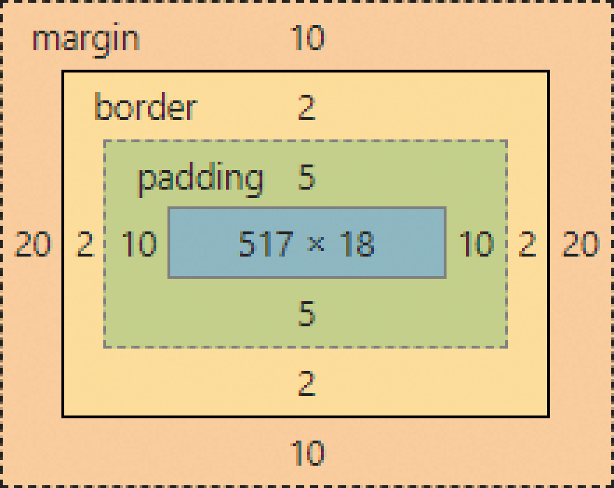

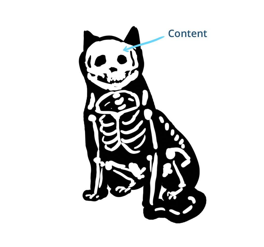
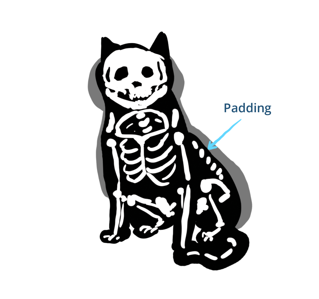
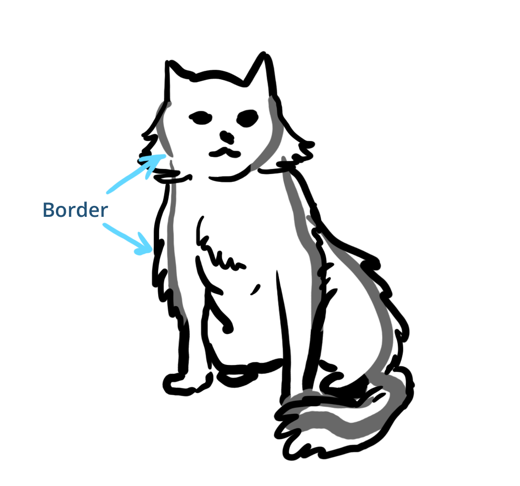
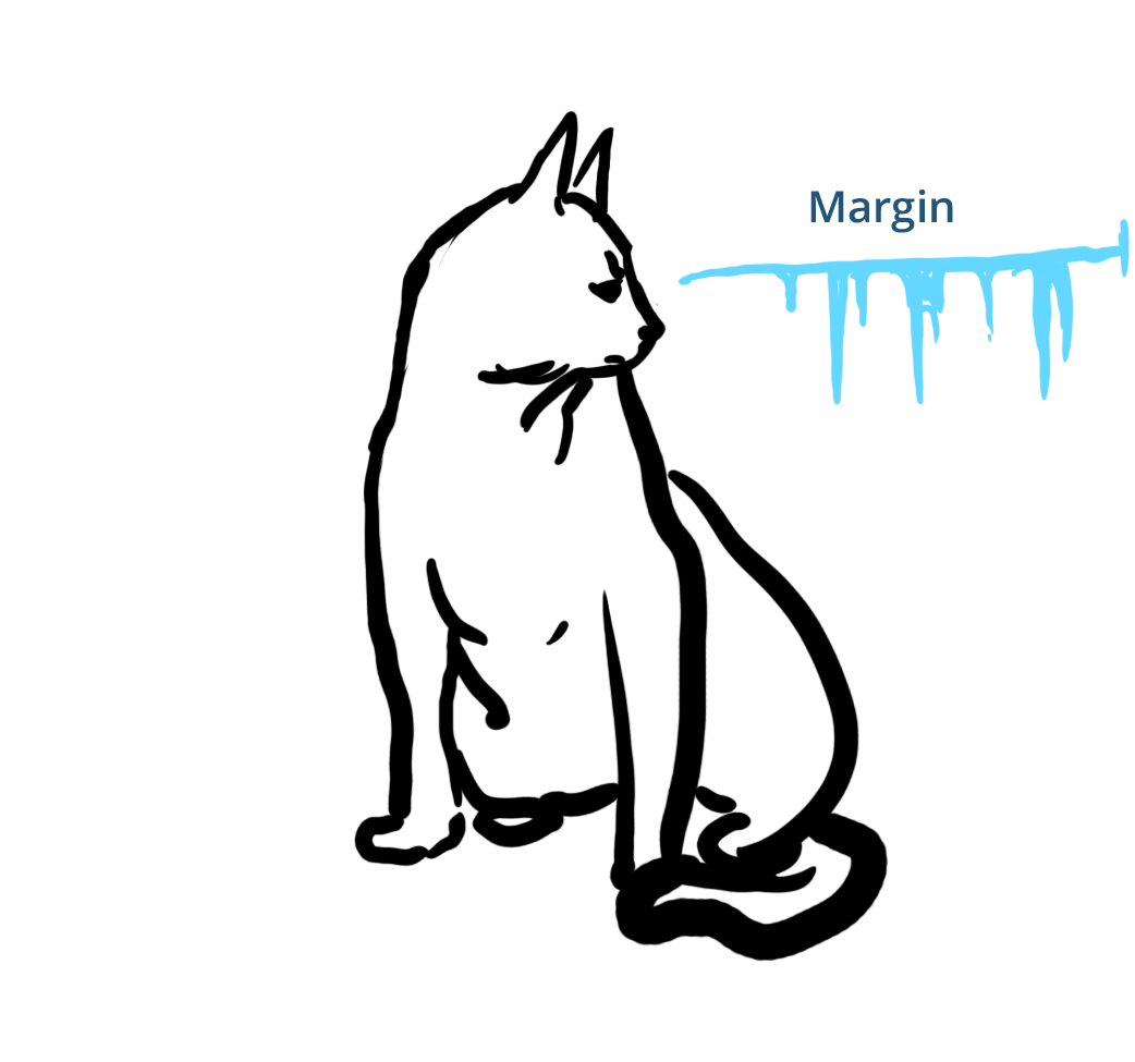
Describe that Cat with Box Model!


Margin Collapse
-or- the effects of cat grumpiness


position
Very useful, and often misused.
Position's Associated Styles
top, bottom, left, right
Change the location of "positioned" elements
z-index
Determines vertical layering of "positioned" elements
position: static;
Position's default value, these elements are not "positioned" so associated styles are ignored.
.element {
  position: static;
  top: 100px; /* Ignored, because position: static */
  left: 50px; /* Static isn't considered "positioned" */
  float: left;
}position: relative;
Update the element from where it would rendered.
.element {
  position: relative;
  top: 25px;
  left: 50px;
  float: left;
}position: absolute;
Update the element based on positioning of a "positioned" parent element
.element {
  position: absolute;
  top: 0;
  left: 0;
  float: left;
}position: fixed;
Positions element to the window and element doesn't move when page scrolls.
.element {
  position: fixed;
  top: 100px;
  left: 50px;
}
position: sticky;
Element will stick to defined position when page scrolls
(Not ready for prime time yet)
.element {
  position: sticky;
  top: 100px;
  left: 50px;
}
How & When to Use position
Scoping position: absolute
.element {
  position: absolute;
  top: 0;
  left: 0;
}
Overlayed caption
Scoping z-index
How do I know which layout method to use?
Some guidelines
Start Outside In

Flow Friendly First
Think in this order as a general rule:
- Grid
- Flex box
- Box model
- Position
Flow Breaking CSS
position: absolute;position: fixed;
CSS that Messes with Flow
- Negative
margin position: relative;iftop/right/bottom/leftare settransform/rotate/translate/skew/scale
When an element isn't cooperating...
- Check the layout properties of the element and it's parent
- Are we using the best tool? Grid vs Flexbox vs Box Model vs Position)
- To the search engine!
- Beware, a significant number of CSS advice on the internet is either outdated or was never good.
- Reputable up to date sources (e.g. MDN, CSS tricks) it's probably good
- For Stack Overflow/low trust sources, try and find 3 different approaches
- Beware, a significant number of CSS advice on the internet is either outdated or was never good.
Would it be best to change the design?
Best meaning for the client, budget, or your sanity.
Break!
Be back at
Layout Odds and Ends
aspect-ratio
.blue-box {
  width: 25%;
  aspect-ratio: 2 / 1;
}❓margin and flex items❓
margin does not collapse inside of a flex container
.flex-item-3 {
  margin-left: 2em;
  margin-right: 2em;
}

.flex-item-4 { margin-left: 2em; }margin and grid items
margin pushes on the grid area instead of adjacent elements.
Logical Properties
/* Assuming left to right, top to bottom language, like English is: */
width/height ~ inline-size/block-size

margin-left/margin-right ~ margin-inline-start/margin-inline-end
margin-inline ~ margin-left + margin-right

border-top/border-bottom ~ border-block-start/border-block-end
border-block ~ border-top + border-bottom

top/bottom ~ inset-block-start/inset-block-end
left/right ~ inset-inline-start/inset-inline-end

/* Follows same rules as margin/padding values */
inset ~ top right bottom left
Transforms, Transitions & Animations
transform
- Manipulates elements visually
- Can move, scale, rotate, and more
- Anti-aliases content
- Messes with document flow, but doesn't break it
- Smoothest and most performant way to animate elements
- Can define multiple transforms
transform: translate(x, y);
.element {
  transform: translate(50px, 25px);
}transform: translate(x);
.element {
  transform: translate(50px);
}transform: scale(x);
.element {
  transform: scale(2);
}transform: scale(x, y);
.element {
  transform: scale(2, 0.5);
}transform: rotate(deg);
.element {
  transform: rotate(45deg);
}transform: skew(deg, deg);
.element {
  transform: skew(45deg, 15deg);
}transform-origin: x, y;
.blue-element,
.red-element {
  transform: rotate(45deg);
  /* transform-origin: center center; Default */
}
.red-element {
  transform-origin: left top;
}Multiple transforms
Order matters!
.blue-element {
  transform: translate(200px) rotate(45deg);
}
.red-element {
  transform: rotate(45deg) translate(200px);
}
Transform Pro-Tips
- Elements with small detail might appear 'fuzzy' after being transformed
- Using 3D transform will use graphics hardware acceleration, which can waste a phone's battery faster
- 3D transforms can cause laggy or slow performance on phones or less powerful devices
transition
- Used to transition from current state to new state
- Can be used on any 'animeatable' property
- Can transition multiple properties
.element {
  transition: transform 1s;
}
.element:hover {
  transform: translate(50px, 25px);
}.element {
transition: transform 1s, background 3s;
}
.element:hover {
transform: translate(50px, 25px);
background: rgba(200, 0, 0, 0.6);
}Timing Functions
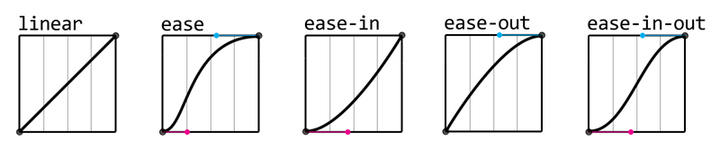 Image from: Jotform - How to Use CSS Animations Like a Pro
.blue-element   { transition: transform 1s linear; }
.red-element    { transition: transform 1s ease-in; }
.yellow-element { transition: transform 1s ease-out; }
.blue-element { transition-delay: 0; }
.red-element { transition-delay: 1s; }
.yellow-element { transition-delay: 2s; }animation
- Animates between multiple configurations
- Can loop a number of times, or infinitely
- Doesn't require user interaction, but can be based on interactions
- Can animate any 'animeatable' property
Definining Keyframes
@keyframes slide-in {
  0% {
    transform: translate(-15em);
    opacity: 0;
  }
  100% {
    transform: translate(0);
    opacity: 1;
  }
}
Apply the animation
@keyframes slide-in { ... }

.element {
  animation-name: slide-in;
  animation-duration: 2s;
  animation-iteration-count: infinite;
}
@keyframes slide-all-over {
0% {
transform: translate(-15em);
opacity: 0;
}
33% {
transform: translate(-10em, -5em);
}
66% {
transform: translate(-5em, 5em);
}
100% {
transform: translate(0);
opacity: 1;
}
}Animation Pro-Tips
Transforms are the awesome
If the desired animation can be done with transform, it should be.
- Performs better
- Won't effect layout
- Animation will be smoother because of anti-aliasing
Live example of transform > other styles for animation
Don't move something that animates on hover
Animation Accessibility concerns
Prefers reduced motion query
.element {
  animation-name: slide-in;
  animation-duration: 2s;
  animation-iteration-count: infinite;
}

/* If they prefer reduced motion, you can remove animation completely,
   Or go with something that has minimal movement */
@media (prefers-reduced-motion: reduce) {
  .element {
    animation: none;
  }
}
cubic-bezier()
Make your own animation timing!
Now with web site helper!:before and :after
(aka pseudo-content)
- Adds new elements to the inside of the selected element, essentially a free
<span> - 2 of these can be placed on any element with a closing tag
- Can insert text into the page, but it is very spotty in accessibility tools
Creating Pseudo-Content
Bare minimum is a selector, before or after, and the content attribute (which can be an empty string).
.element:before {
  content: '';
}
This creates an empty invisible element.
Clearfix uses an empty invisible after element
.clearfix:after {
  content: '';
  display: table;
  clear: both;
}
Can add supplemental content
So long as it isn't necessary for the content to be understood.
.email-address:before {
  content: 'Contact me at ';
}Can expose html attributes
[data-label]:before {
  content: attr(data-label);
  display: inline-block;
  margin-right: 0.5em;
  padding: 0.25em 0.5em;
  background: rgb(225, 200, 0);
  color: rgb(100, 50, 0);
}Can show URLs of links in the print stylesheet
@media print {
  main a[href]:after {
    content: " (" attr(href) ") ";
  }
}CSS Accessibility Concerns
Color contrast and Font-size
There are a lot of tools, Web AIM contrast checker is an easy one
Accessibility browser extensions like WAVE and Axe Devtools will test for this, but they have false positives sometimes
Add :focus selector when adding :hover selector*
.button:hover,
.button:focus {
  background: #121399;
}
*In general, form elements are an exception, e.g. text input, select, checkbox, radio, etc. Having a separate hover vs focus is often preferred with them.
Content hiding options!
- Hide from everyone!
display: none;visibility: hidden; - Hide from sighted users
CSS clipping, like.element-invisible.sr-onlytext-indent: -9999em;aka the Phark technique 🤓
Make hit areas 45x45 for touch*
(and better mousing!)
*This is less applicable to links in the flow of text and content that isn't near more clickable elements
Break!
Be back at
Coming up: Setting up projects to avoid CSS related headaches
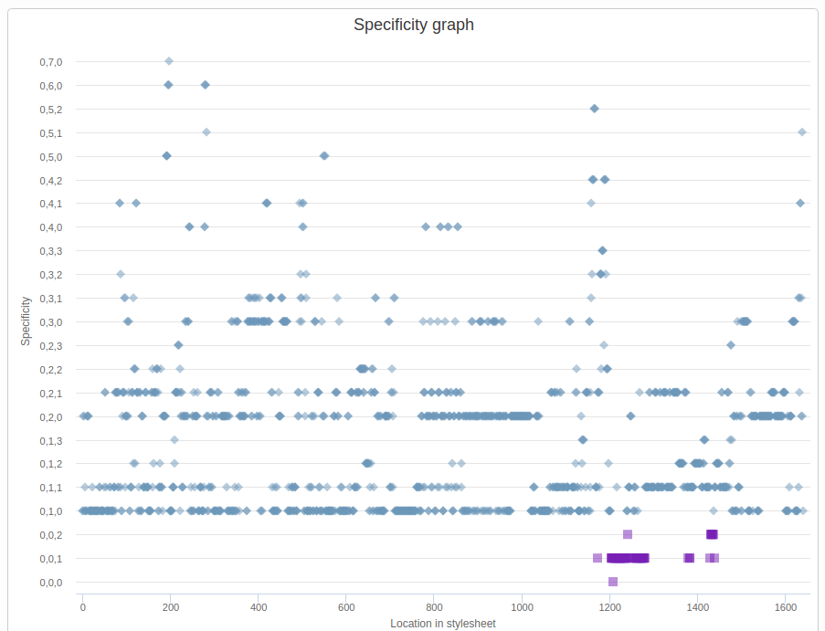
- Specificity
- Selectors
- Architecting Your CSS
Setting up projects to avoid CSS related headaches
A tale of two project's CSS
Photo by Wade Austin Ellis on Unsplash
body.html.page-node-X
#header
#header-wrapper h2,
body.html.page-node-X
#header
#header-wrapper
#block-views-view-name-block-1
> .view-view-name
> .view-content
> .views-row
> .row-inner
> .views-field-title,
body.html.page-node-X
#header
#header-wrapper
#block-views-view-name-block-1
> .view-view-name
.attachment
.view-heading,
#block-views-view-name-block-1
> .view-view-name
.attachment
body.html.page-node-X
#header
#header-wrapper
.view-heading,
body.html.page-node-X
#header
#header-wrapper
#block-views-view-name-block-1
> .view-view-name
.attachment
.view-view-name
.views-row
.views-field-title,
#block-views-view-name-block-1
> .view-view-name
.attachment
.view-view-name
.views-row
body.html.page-node-X
#header
#header-wrapper
.views-field-title {
display: block;
text-align: center;
line-height: 1.3em;
padding-top: 140px
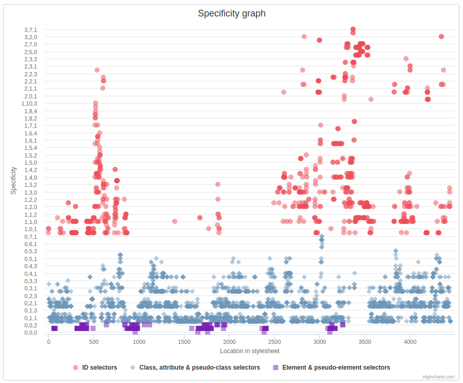
}CSS Selectors & Specificity
Simple Selectors
-
tagnameType/Tag (0, 0, 1) -
.class-nameClass (0, 1, 0) -
#id-nameID (1, 0, 0)
-
*Universal (0, 0, 0) -
[attribute]Attribute (0, 1, 0)
Attribute Selector
<div attribute-name="value"><div>
[attribute-name]
[attribute-name='value']
[attribute-name*='lu']
[attribute-name^='val']
All of these are a specificity of (0, 1, 0)
Combinators
-
>Direct descendant (0, 0, 0) -
~General sibling (0, 0, 0) -
+Adjacent Sibling (0, 0, 0)
Pseudo-Classes
-
:hover, :focus(0, 1, 0) -
:first-child, :last-child(0, 1, 0) -
:empty(0, 1, 0) -
:checked(0, 1, 0)
:nth-child Pseudo-Classes
-
:nth-child()(0, 1, 0) -
:nth-of-type()(0, 1, 0) -
:nth-last-child()(0, 1, 0)
How to read selectors
In CSS, read back to front
.article h4 a
.main-menu > li a
.bio-photo ~ .bio-name
.js .carousel .slide
Choosing the best selector
for the job
- Keep Specificity Low
- Only target what you mean to
- Try to use selectors that explain what they're targeting
Keep Specificity Low
Too Loud!
-
#main .article a(1, 1, 1) -
#page #main a(2, 0, 1) -
h4.sidebar-title a(0, 1, 2)
Much Better!
-
#main .article a(1, 1, 1) -
.article a(0, 1, 1)
-
#page #main a(2, 0, 1) -
[id="main"] a(0, 1, 1)
-
h4.sidebar-title a(0, 1, 2) -
.sidebar-title a(0, 1, 1)
Only target what you mean to
<article class="node node-news node-published node-not-promoted node-not-sticky clearfix" id="node-news-2" about="/page-url" typeof="foaf:Document">
  <div class="field field-name-body field-type-text-with-summary field-label-hidden">
    <div class="field-items">
      <div class="field-item even" property="content:encoded">
        <p>Hello World!</p>
      </div>
    </div>
  </div>
</article>Try to use selectors that explain what they're targeting
When possible create descriptive and specific class names
.node-news .field-name-bodyThan this:
.node .field
CSS Architecture Best Practices
The larger the project, the more important CSS standards & architecture are.
Starting from scratch
- Use normalize.css, or reset.css, or similar
- Decide on a class naming convention
Think about explicit vs utility classes
Explicit classes are meant to target very specific elements, e.g. .widget__photo--captioned
Utility classes are meant to apply very specific styles, e.g. .text-align-center
Consider prefixing utility classes, e.g. .u-text-align-center
Document all of these decisions in a README
e.g. Lullabot.com Example
Working inside of a framework
- Consider using a prefix for custom classes especially if the framework does not (e.g.
gr-for giantrabbit.com) you know where it came from - Don’t write selectors that use framework utility classes unless you’re extending them, e.g.
.sidebar .col-lg-3 {
  text-align: right;
  /* .col-lg-3 is intended for layout, not text treatment :( */
}
Guidelines for framework/contrib vs custom code uses
- Using just the grid? Grid + some components?
Download a paired down version of the library. It's easer to add more later than take it away.
-
Should your project prefer or avoid using framework components?
Document your decision, document what projects you prefer to pull from.
On Selectors
- Use classes, not id's or tags (except for base tag styling)
- Write styles so the cascade starts at the most general, to the most specific. Some good examples are SMACSS or Inverted Pyramid
- Avoid inline styles as much as possible
- In markup prefer extra classes
- In Javascript prefer using CSS custom properties which can receive a default via CSS.
- Don't use
!importantunless you're overriding inline styles or another important that you can't remove.
Only be as specific as necessary
- Avoid unneccessary parts of your selector, e.g.
.main-header .header-logo - Don't 'qualify' classes by adding the tag name e.g.
header.main-header - Avoid compound selectors by creating highly specific class names; e.g. BEM class naming
.widget__title--featured
- If you're using Drupal or a CSS Preprocessor, break up your CSS into small organized files
- Use auto-prefixer, in a build step, as a plugin for your editor, or use Autoprefixer.github.io
- If id is the best styling hook, use
[id=”id-name”] - If specificity is too low, but adding other class names would be bloat, use an attribute selector like
.my-widget[class][class]
Fancy nth-child Tricks
CSS Custom Properties
aka CSS variables
Syntax
:root {
  /* Setting a custom property */
  --my-cool-var: #c00001;
}

.my-element {
  /* Use the custom property with no fallback */
  background-color: var(--my-cool-var);
  /* Use it with a fallback, in case it isn't set */
  background-color: var(--my-cool-var, #c00);
}
Let's do it live!
Page Performance & CSS
CSS Selector speed doesn't matter
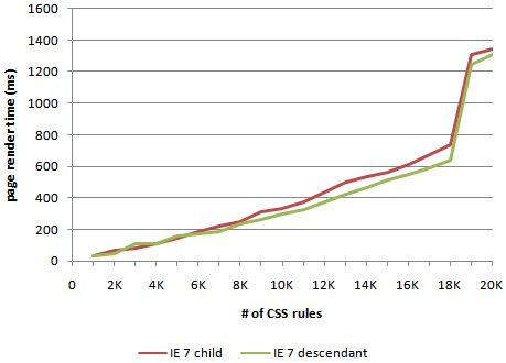
Technically it does, but in the real world it's low value and high cost.
See:
Performance Impact of CSS Selectors - Steve stevesouders
Things to avoid:
@import- Base64 assets
Tips:
- Manage filesize with minification
- Use
will-changeto clue in browser to animations - Use
font-displayto prevent a web font from blocking render - Test interactive components without JS, make sure they're not unusuable
- Inline critical CSS
For animation or manipulation:
- Transforms for animations whenever possible
- Don't use 3d transforms (typically used for parallax)
- Don't cause reflow when possible
Debugging tips and tricks
- CSS Layers
- :where, :is, :has
- CSS Nesting
- Container Queries
- @supports, @style queries
- New CSS color stuff
- Light mode/dark mode
Sources
- Robin Rendle, Getting Started with CSS Grid - https://css-tricks.com/getting-started-css-grid/
- Rachel Andrews, Grid By Example - https://gridbyexample.com/
- Chris House, A Complete Guide to Grid - https://css-tricks.com/snippets/css/complete-guide-grid/
- Manuel Matuzovic, A Collection of Interesting Facts about CSS Grid Layout - https://css-tricks.com/collection-interesting-facts-css-grid-layout/
- Chris Coyier, A Complete Guide to Flexbox - https://css-tricks.com/snippets/css/a-guide-to-flexbox/
- Jen Simmons, Multiple examples - http://labs.jensimmons.com/
- Sara Soueidan, Auto-Sizing Columns in CSS Grid: `auto-fill` vs `auto-fit` - https://css-tricks.com/auto-sizing-columns-css-grid-auto-fill-vs-auto-fit/
- Mike Herchel, Getting Up and Running with Grid - https://herchel.com/2018-01-15-css-grid/
- transform, MDN web docs - https://developer.mozilla.org/en-US/docs/Web/CSS/transform
- MDN, Using Media Queries - https://developer.mozilla.org/en-US/docs/Web/CSS/Media_Queries/Using_media_queries
- Stock Photos from Pixabay.com